Submit your design (54)
As this is a fully democratic pitch, you need to have the freedom to express your ideas. Send your designs (and name) to us and we will publish* them on this page.
Submit your designs: yourdesign@movingbrands.com
* jpg/png with max pixel width of 650px
thought I’d throw in my two penneth…
London is the jewel in the UK crown…
It’s multi cultural…
It’s vibrant…
it has an ‘L of a lot going for it…
![]()
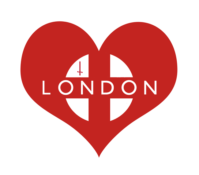
The main inspirations I had from this were the London Underground, the City of London’s flag (as evident with the sword in all of the designs), and the basic heart, showing how a simple shape can mean so much.
This is London, or simply LO 🙂
Sitting here at the foot of the Canadian Rockies thinking of my home town, this says it all for me!
Although I’ve never been to London I couldn’t resist throwing my hat in.
It was just too much fun.


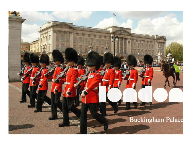
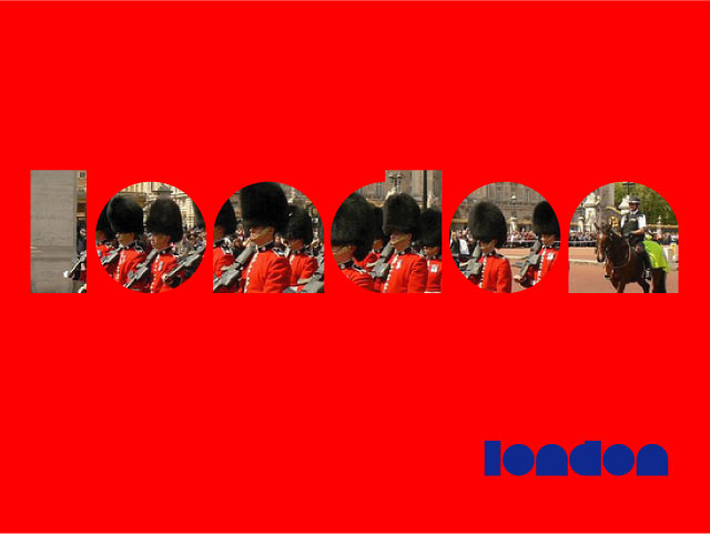
London – making it’s mark…
With a feel of a: Seal, Splatter, Stamp and Mark of approval.
Lovely and simple…
Here’s my 5 cents as a non-Londoner who loves London.
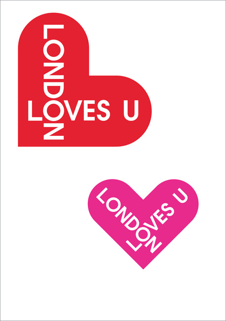
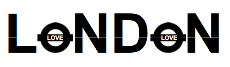
Love London!
Twice the Love

Given the fact that the Requests for Proposals are due tomorrow, here is a simple and intended to be fun concept. Enjoy!
![]()
This is funny…I have just seen that you have three hours or less until your deadline but pressure always helps decisions, sometimes ?
Being an English Creative living and freelancing aboard for five years in Germany
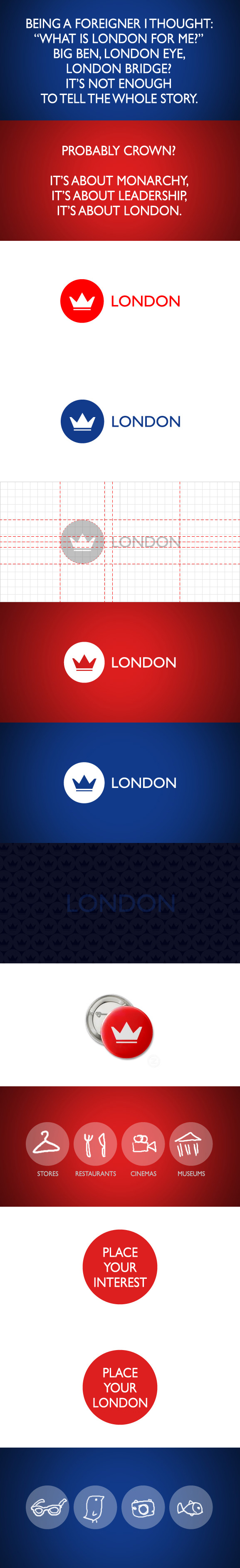
London is about
Having Money or not, living like a King or not, your location And who you are ?
Plus for me this must play a dynamic between history and the future, the depth and the diversity of culture…tough to then keep it simple !
I had an hour or so, would love to continue but I believe the window is closed anyway
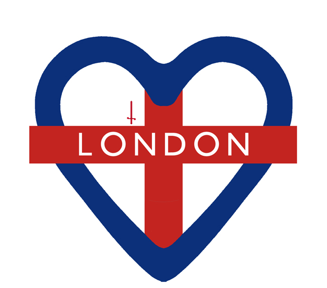
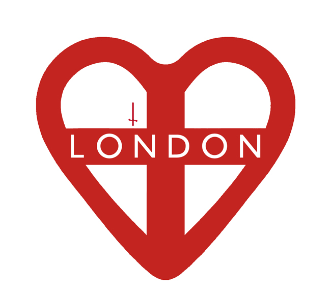
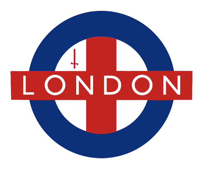
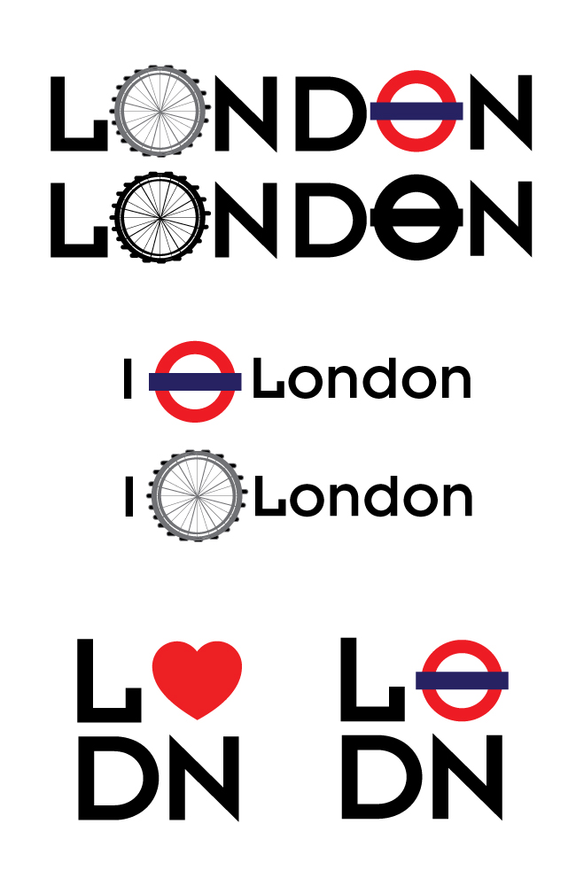
Heart logos might be seen as wannabe I♥NY, but here’s my Johnston arrow on a heart.
![]()
I could see that you are thinking hard and wished to show you this thought as I just received an email from design week.
The Big idea is to have a linking textural and diverse sub line. With a colour pallet that has no limits.
LONDON:
IT’S ABOUT INSPERATION
IT’S ABOUT COMMERCE
IT’S ABOUT HISTORY
IT’S ABOUT CULTURE
IT’S ABOUT BUSINESS
IT’S ABOUT BEING FIRST
IT’S ABOUT YOU
IT’S ABOUT US ALL
IT’S ABOUT TECHNOLOGY
IT’S ABOUT THE FUTURE
etc.
You can therefore, four fill any communication need backed up by any visual them that a stakeholder is in. Simple and I think nice.
I saw this in the paper this evening. Don’t have any graphic tools so i used MS paint.
Hope you guys like it.
![]()
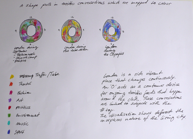
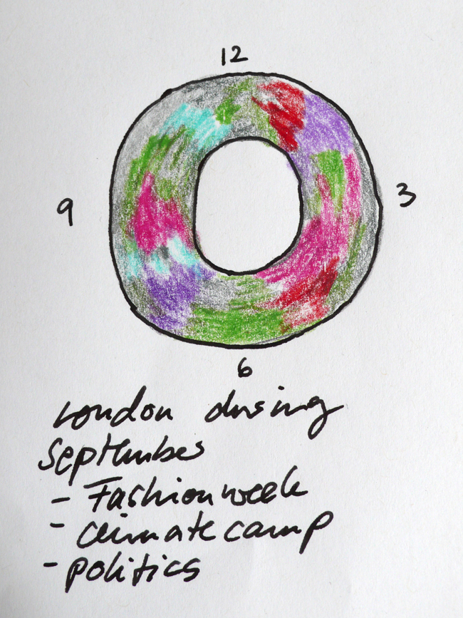
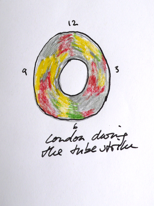
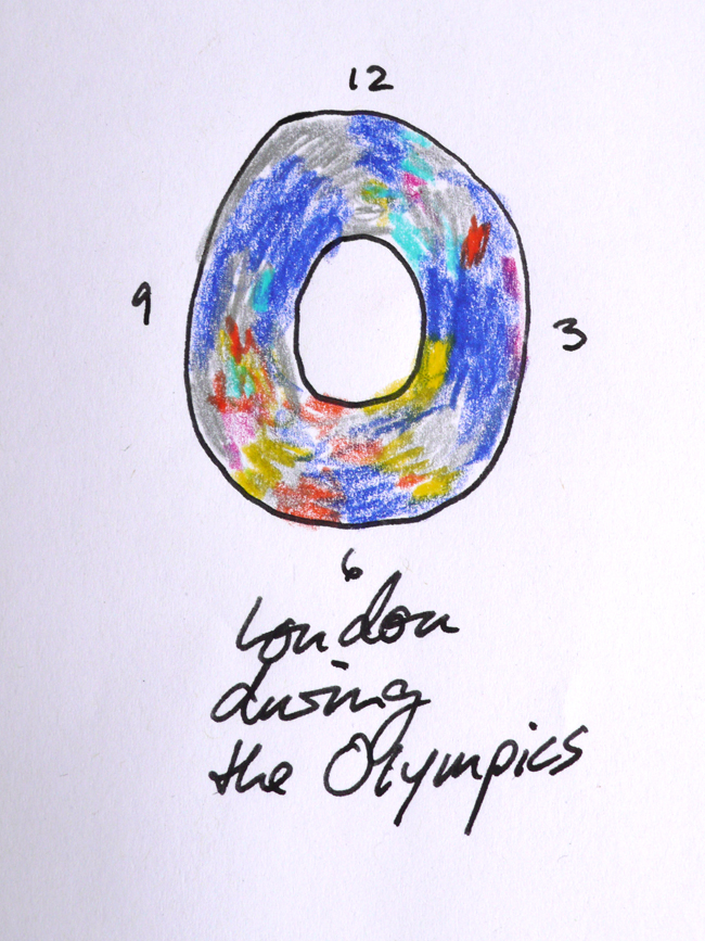
“London is a rich vibrant place that changes continously. An “O” acts as a container device for ongoing twitter conversations that are mapped to colour and time. These conversations are linked to subjects with the #tag and are linked to different colours. The ongoing colour washes give an idea what people are talking about whilst also representing the morphous nature of the living city.
London is never static – it is allways evolving. I love London!”
Having too much global fun — thanks for the site/blog — it’s great
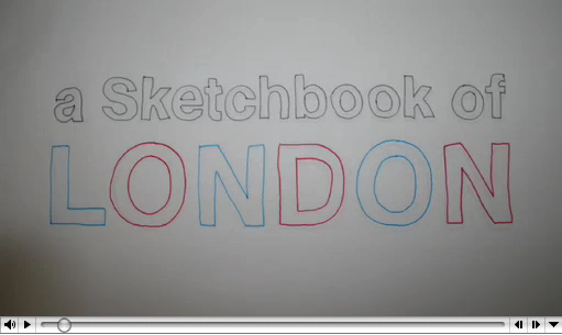
My View of London, as a student from AUS on exchange at CSM, a hand illustrated animation:
 F
FHaving too much global fun — thanks for the site/blog — it’s great
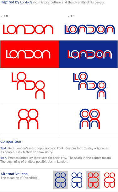
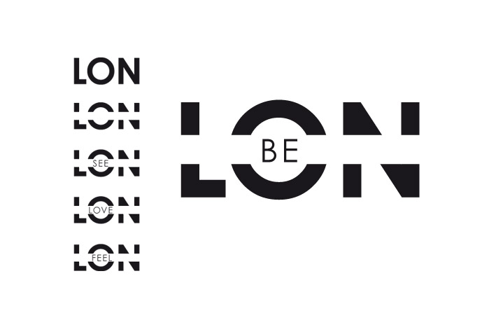
I want the name to feel alive and different.
Also flexible so it can be attatch easy to other london brands
![]()
![]()
![]()
Sound should form a major part of this and we would of course love to be involved in that. There are four aspects:
1 London’s sound heritage – a London sound archive with interactive booths in public places featuring many of the historic sounds of London (tug boat whistles, steam trains, rag and bone men, police bells, mind the gap and so on).
2 The sound of London – a generative soundscape that expresses the essence of London. This could be used on the web, in installations, as a download, and in variations as a set of ring tones.
3 London sonic logo – modern characteristic sounds of London could be incorporated into a consistent family of sonic logos that express and embody the essence of London. These could be used in train stations, airports, tube stations etc instead of the various bings and bongs that call attention to PA announcements, as well as of course in TV and cinema advertising as a sign off.
4 The voice of London – where London is speaking (as opposed to discrete brands like South West Trains) it should have a consistent voice (if recorded) or at least vocabulary and style (if live). Is London male or female? Is it old or young? Is it formal or informal?

Here are my first thoughts for a brand for London. London is a great an diverse city, so it is difficult to incorporate everything London is about.
‘A’ is a simple crest and text logo to harken back to England’s sovereign history.
‘B’ takes a similar approach. But also presents a simple tourism suggestion. “Do London”.
‘C’ is a freer approach, meant to exhibit that the city is also a modern one that is leading in to the future.
‘D’ was a simple attempt to give a nod to teh great classic architecture on the city.
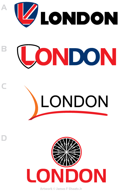
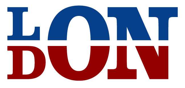
This idea of a simple marker or one of the red map pin that marks a place to do something. “Do” London is inviting the world to discover London’s many sites. The circle compliments all the other existing logos.
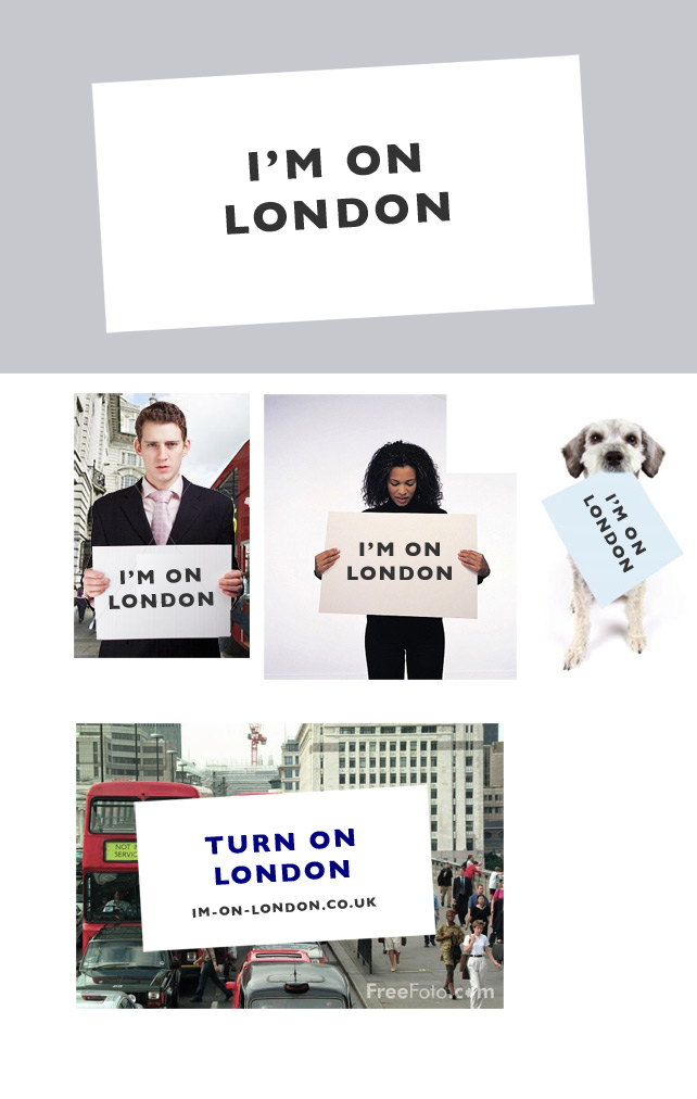
My idea is to create a brand new next-generation Speaker’s Corner. More in tune with today’s channels of dissemination, it’s a digital one.
The brand tagline: “I’m on London.”
It’s a website, a hashtag, a rallying call, anything you want it to be.
It’s also a physical place. I suggest creating this by closing off Picadilly Circus to traffic and turning it into a giant interactive space. Allow people to send all kinds of messages (email, sms, twitter, videos, etc.) that are displayed on the giant LED / Video displays. “I’m on London” provides various channels, for different kinds of discourses. For the benefit of people without access to supported devices, London is fitted with “I’m on London” booths; small interactive kiosks that allow you to record, write and send off messages to the new Speaker’s Corner.
All email messages sent from the account of the Mayor of London is being displayed in real-time. Your messages too.
London itself becomes a channel for people to let their voices be heard.
In a manner symptomatic of our age, people and businesses do not only want to be in London, they now want to be able to say: “I’m on London.”
The designs for A Brand for London are inspired by the London Underground and also the London Eye. The London Underground was the first underground railway system in the and Londoners and travellers alike should be proud that they can be part of this ever expanding rapid transit system. The London Eye, being the most popular paid tourist attraction in the UK, its design is contemporary and beautiful, and should be the envy of London as it allows people to view London’s beautiful skyline.
These two attractions should surely build the brand for London as being innovative, beautiful and contemporary, something that London is not yet known for.
The font chosen for the design is Insignia, which is the typeface created by Neville Brody, a British (and Londoner!) graphic designer and alumni of the London College of Communication. Embrace London!
First logo concept has two icons integrated, the London Eye and Underground.
The second and third concepts use the basis of I love London.

My name is Egor Gorev, I am a 20 years old graphic designer from Republic of Moldova. During all my life I dreamed about London, but have never been there. Also, thought a lot about a job in this city, that’s why it is interesting for me to take part in London re-brand.
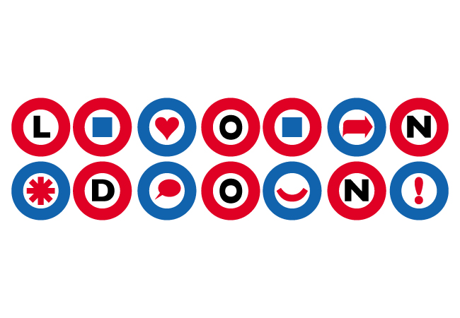
The idea is to create a set of icons from the main logo, which will help people to find any places they need (bars, restaurants, theatres, museums and etc) on the map.
Also, any icon which is put in the circle will be associated with London, that’s a way to make this brand fashionable and close to people (anyone can create his own icon and wear it anywhere).
Hello – I would like to add my submission for London’s new brand image. I’ve been there a few times and loved the city.
There are many offerings in London for everyone and simply put you just GO. There’s more to this concept however this is the brand imagery I have created.
![]()
I‚Äôd like to contribute to your pitch with my ideas and logo. 🙂
Rationale:
London has a wide range of peoples, cultures, and religions, and more than
300 languages are spoken within its boundaries. A multicultural
conurbation where everyone understands each other using the English
language.
London is the first destination in the world for people who want to learn
English.
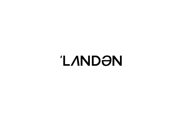
The logo I’ve designed is the phonetic representation of the word LONDON.
I hope you like it.
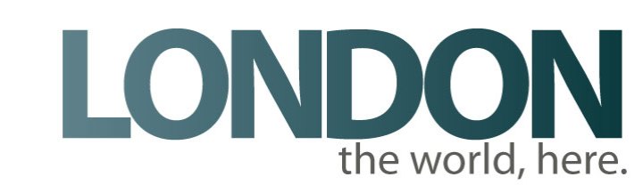
Logo for London

Community, Fun, Cultural, Ideas, Art, Love, LONDON.
Here is my design for the london branding project.
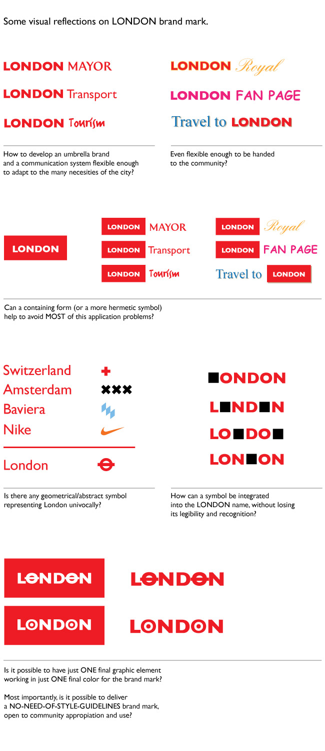
My name is Dario and I never been to London in my life. So probably I not the most indicated person to talk about on a London brand, since i completely ignore the subject, the only things i can think or imagine about the city are mere cliches. And maybe, this thing is a good things, since cliches unfortunately are the brand.
And i have to say, that in my mind, the graphic cliches about London are the same elements presented on the “London‚Äôs Design DNA” and “Elevating an icon” posts. I think they transmit visually the language of a city in a almost univocally way.
It is the way cliches are used that makes things different. For instance, using social media nowadays in any aspect of business in a cliche, you hear everywhere that brands have to be in social media, but is the way you got to go social the important thing. You pointed that out in the “London voices” post.
When i thought about how could i participate somehow in this blog, I started by taking those things i found relevant in the process you are sharing:
cliches + social media = graphic mark for the London brand
London brand mark has to be cliche enough in order to be immediately linked to LONDON, and strong enough to be handed openly to the community for usage without losing its identity (no brand style manuals allowed).
Here I send you some reflections on the graphic solution for the london brand mark.
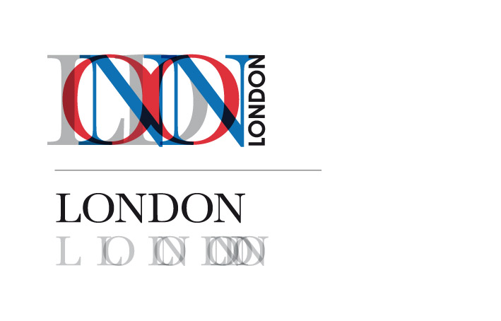
North / South divide innit.
Well this is what I came up with…
“Live London”
Rational…
* Accomodates the viewer to consider the self as a organic living part of a dynamic city (every age, gender, ethnic background can express being part of ‘Live London’ in there own way – Live London – Your Way etc –
* International marketing – Live London – Its way of life – A global community under one roof with opportunities to visit, enjoy, learn and ‘Live London’
* Like myself its illiterate(d) compact and packagable.
RE Branding it thats yr area – But thinking butterfly wings (IE there effect….small actions can have massive knock on effects – Butterfly flaps wings results in hurricane in guatamale?! etc. Well also it could reflect the opportunities for individuals to have an effect within there street, community, London and in turn the rest of the world depending on there aspirations. either way there are made to feel part of something bigger.
Ok thats quite enough for now…
Upwards & Onwards…

I saw that RAF mark and realized they could have so much fun modernizing it and de-militarizing it. Idea #1:

For me London is the heart beat of our country and sits snug within the M25 circular.
Here I have illustrated how an abstract roundel is formed when you trace the M25 and inner circular representing London’s position within UK
Maybe the M25 shape could form a heart with the roads inside forming vessels?

For me, London is home.
It’s home to my life, my friends, my family
It’s home to a thousand years of history
It’s home from home for a multitude of cultures
It’s home to major global events
It’s home to the world’s largest companies
It’s home to progress
It’s home to anything we want it to be.
Just a thought on the London project (I don’t do Twitter!)
Agree with the roundels being really iconic for London. Also my feeling is to try to capture London’s role/lead in the World – and it’s “top right” position on a globe is sort of known.
Rather badly ‚Äì I‚Äôve tried to capture this diagrammatically below…but I think you may get what I mean!

![]()


[…] Absolutely love this. . .branding and digital agency Moving Brands has decided to document their pitch for the London re-branding public tender, as, in their words, ‘ we think it’s important that a public brand like this [London] isn’t designed behind closed doors.’ With this they have set up the blog A Brand For London to make public all their development work, and you can get involved as well by submitting your design / ideas here […]
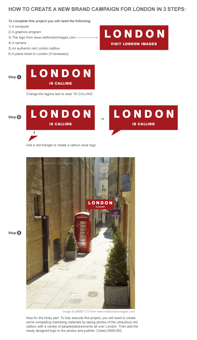
My submission btw, was a conceptual mockup suggesting that you could alter the RAF symbol into a bullseye for whats happening “in” LOND(o)N. Conceptually it would require converting the bullseye into the second O in London. I’d suggest taking texture, aesthetic looks and feels from the various places as to where it would be. IE if it was Wimbledon I’d suggest using texture from the court or the stadium and fill in the o ( by doing this you would show what’s happening in London literally. I could see this as a campaign that could give you a peep hole into the city’s various parts of life. The whole point is to take it from the military usage and historical meaning and separate it to a unique modern twist. And I think the colors arrangement I had just was scratching the surface with this idea. Good luck!
IT IS APPARENT THAT SCARLETT FU, DESIGN #19 HAS COMPLETELY COPIED MY DESIGN. THIS SHOULD NOT COUNT. THIS IS AN EXAMPLE OF DELIBERATE AND TOTAL MANIPULATION OF ONES DESIGN INTO ANOTHER. PLEASE TAKE NOTICE.
…it is conceivable that two (if not legions) people will have considered incorporating two of the most visible/high profile landmarks in London into an identity for the city… personally I prefer Scarlett’s execution
Michael, unpress the caps lock and relax. This is not a competition, it’s a discussion of ideas.
My apologies to everyone, Scarlett, I was on the impression that this was a competition.
My dreams got the best of me. Please forgive my manner.
I was too serious on this matter and apologize.
Design is to have fun not to be serious. I’m sorry.
no worries michael
No 16 for me is the freshest idea i’ve seen!!
definititely has potential and it’s very interpretive
slick different modern.. it looks like its moving, complex but energy still flows through it
the only thing is having it printed real small
wel, there’s my bit c:
In my opinion(guaranteed to cause attention) the only 2 worthy of noting is #15 & #6. some of the remaining logos are nice but they have a ‘i’ve that before’ feel to them, and i’m not sure that mimicking the I{heart}NY is a good way to put London in peoples attention for good reasons. I do agree that the Johnston Underground logo is iconic of London but its definitely to do with transport and not London as a whole.
This is going to be tough.
There are some fine examples of graphic lateral thinking here and although I’m in the business of creating visual identities, I think London needs a logo like the moon needs a logo. It doesn’t.
Practically everyone on the planet has a visual impression of the city, and yet a only the tiniest fraction have ever been near it. Bogota needs a logo, Zagreb does too, London doesn’t.
The attempt to distil the City into a single icon is futile and probably an insult to the City’s heritage, its residents and even its future.
Graphic designers need to realise that not every problem is solved with a graphic solution. (If the only tool you have is a hammer, every problem looks like a nail).
Designers would garner a lot more respect for the profession if they were to simply say: “This is not a task for us, we’re not needed here.”
And to throw up ideas for free will certainly ensure that the graphic design achieves the same integrity as the advertising industry.
I think that the logo has to be versatile. Both n.16 and 6. are easy to adapt too different situations without loosing their feel. N. 16 is probably my favourite.
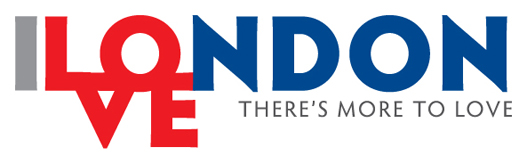
I really enjoy the first iteration in Design #27. I think the Union Jack is such a quintessential part of London’s identity, and this design does a nice job riffing on and modernizing the classic Union Jack into a more telegraphic icon in the vein of “I ❤ NY"
[…] posted this simple and intended to be fun concept to a blog dedicated to sharing ideas on creating A Brand for London. I’ve heard the winning designer(s) will recieve up to £600,000. I think that translates […]
Brad Thomas
Design #41
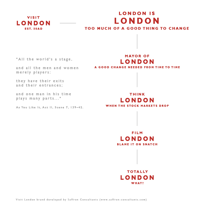
You’re on the mark. Why use a sign-off or another new logo. Just use the Visit London brand. You can even extent the brand architecture.
http://saffron-consultants.com/featured-work/archives/visit-london/
[…] There’s a public pitch to create a new brand for London. You can submit your ideas here. […]
#31 hints at the shape of Greater London, looks interesting, can be used as an adornment on other brands.
However maybe the ‘London’ at the centre could be a little larger. That would make the whole thing a little more friendly. Perhaps a different typeface. The geometric element amply provided by the shape, an alternative font would seem more human. Maybe the ‘LONDON’ would be allowed in any typeface, UPPER CASE, Sentence case or lower case (MTV-style variations).
My #38 is less flexible, but I think that it’s important that people be happy to wear the logo wherever they go…
#40 is a winner. I just love the feathered edges of the lion and how it blends seamlessly into the washed out union flag in the background. In fact on closer inspection there are 3 lions – this id is giving more each time i take another look at it.
#32 – no matter what superlatives you use, it still looks like a tie-dyed donut.
I also love the originality of coming up with the novel twist on the london underground logo – this is indeed the zenith of creativity.
@#47. Cool, I feel the onion is like adding an abstraction layer to #20.
The weak point, however, is the idea of relying on and relaying from socializing apps. It just adds to the ‘corporatization’ of life.
Great to see all these different approaches 🙂
This site is an result for paid pitches everywhere…
Ha ha ha ha brilliant! I genuinely don’t know who’s being serious here or who has their tongue stuck, no wedged… embedded, in their cheek. Marvelous, absolutely brilliant!
[…] result in more mockery and/or accusations of crowd-sourcing on the grandest of scales. Only the briefest of skims through the entries so far to Moving Brands self-initiated competition reveals just how scary design can get when placed in […]
[…] Submit your design (53) […]
Sorry, I can’t help but comment on the poor writing in support of some of the entries.
Main offenders:
Design #37: woeful spelling, grammar and an incomprehensible explanation, particularly the last sentence.
Design# 45: if you’re going to submit a piece of text for your entry, at least make sure it’s grammatically correct and makes sense. That third paragraph just does not scan, however many times you read it.
Design #48: you’ve got a false possessive apostrophe in your tagline. Might let it go if it were in your explanation, but in the tagline of your logotype?
Final note: these things can be checked before you submit your entries. Just ask someone with decent spelling, grammar and language skills to read your explanation, and any text in your design.
Pedantic Sod,
I’m sure we all really appreciate your coments and a big slap on the wrist for bad grammer, god it’s like being at school… but lets see what you can bring to the table Mr big shot because at the moment you talk a good game, but i’m sure we would love to see what you can show us.
Over to you…
[…] for London. One of the most noticeable pitches (which didn’t get through) was A Brand for London by Moving Brands. Effectively throwing the doors of design open to the great british (and […]
[…] result in more mockery and/or accusations of crowd-sourcing on the grandest of scales. Only the briefest of skims through the entries so far to Moving Brands self-initiated competition reveals just how scary design can get when placed in […]
Moving Brands… Did you do all these logos and just cant decide which to choose in your brainstormin sessions! 😀
Much Love.
Jamesy.
[…] Check out what they’ve thought about already… and what others have submitted. […]
[…] something that makes real sense: let the londoners themselfes discuss and take part in this task. This is the interesting pitch website where you can have a look at the whole process – even if the […]
Please could you tell me when closing date for entries is.
Many thanks,
It has to be number 53 for me – genius!
[…] thousands of computer literate enthusiasts busily creating visual atrocities every day. Some of the entries for the London logo demonstrate precisely how much the quality of work can […]